Thursday, June 4, 2009

OB1 CHAIR


THE EVENT
The Salone Sattellite is known for its innovative design entries and "out of the square" thinkng. I tried to keep this in mind when i was designing my chair. I tried not to make it look like a box by adding interesting triangulation and i also wanted it to be one piece, rather than several pieces
IDEA
The idea behind the OB1 chair is that it can be used as a chill out chair for people attending the Salon Sattellite in Milan. Anyone can sit on this chair and read a brochure, rest their feet, eat some food etc
WHERE:
These seats will be placed in various locations around the exhibition, especially in high traffic areas where people are more likely to need to sit and rest
XANITA:
The chair fits into a 1200 x 1800mm board of xanita is only 1 cut out piece. It is easily assembled and dissassembled with little stress to the material. It is easily carried flat or in chair form and can be flat packed for transportation.
With more material and time, the OB1 chair could be transformed into other seating and table options.

FINAL MODEL VIDEO

OB1 CHAIR

PROCESS


This shows the process of how my chair is put together. It is all made out of the one piece of material and i wanted to use minimal joining methods so it consists of 1 slot mechanism and 1 tab mechanism. These hold the whole thing in place. The chair has open wings on the side to give the illusion of flying (starwars spaceship = OB1 chair). When some one sits on the chair and leans on the back rest, the sides are actually pulled in, giving the chair movement. I also like the way that it "reacts" or interacts with the person who uses it.


FINAL MODEL


FNAL MODEL - CUTS & BENDS


I used a number or bends and cuts. I mainly used radiused bends as they looked better. I had to allow for extra xanita board on the radius bends, they range from 15 - 35 mm

Tuesday, May 26, 2009

FLAT PATTERN


This is my final flat pattern. I have accounted for the xanita boards thickness by cutting out 10mm or more holes and sections to create the neccessary folds. The only issue, which i do not think can be resolved, is that there will not be a true point. It will be a small circle, but should look like a point from a distance. I do not think that this will effect my design.


These are images of my final design. I have refined the back rest and the seat. The seat is now flat rather than on an angel so it will be easier to sit on. i have used a tab system, but i want to make a feature of it, by making it look like stiching. I will acheive this by using a few small tabs rather than one big tab to join the seat to the body. I am happy with the design as it is all from one piece and in theory should hold 150kg.

BRANDING


I want the branding to be simple. I wanted to focus on the fact that the Salone Sattellite was in Milan, hence making Milan the feature. I was experimenting with using just the word milan, or simply an M, however i thought there could be some confusion with Design Made Trade Melbourne. I think i will go for one of the three final designs in the middle of the image. They can be black or incorporate colour. Black seems to send the strongest message.


There are a couple of different branding methods that i have considered. These include different types of cuts, materials and media. The cuts look good, however, for my logo they would not be practical as the logo is a word. I am leaning towards using some sort of acrylic or oil paint to stencil on a pattern, or using a spray. I will do further tests on the xantia to see the effect it has eg - if it runs, how long it takes to dry etc


This is just a really basic diagram of where i am thinking of putting the logo. Im not sure which one i am going to choose, once i have made my final chair, i will decide which position will look best.

XANITA EXPLORATION


Looking at the Xanita material, i was able to decide which folds would best suit my design. I decided that a mitre fold for the bottom was good and for the seat itself, i wanted a smooth radius edge so it feels comfortable to sit on.

Here i was looking at ways to create the point out of the xanita material by cutting from the one side. I decided to put a small circle in the middle and cutting mitre cuts off that. This allowed me to create the illusion of a point even though there is a small flat section.

I also found that one single line cut was needed through the middle of the xanita to create the accurate bends. Even though i had to take out quite a bit of material, it is still relatively strong and should hold well on a 1:1 scale.

REFINEMENT


This was basically my final design which incorporated the triangulation, which also providing adequate support. The deisgn itself is still true to what i wanted it to be.

This design was clever, in that the feet or base of the chair came from the same piece of xanita which had been threaded through the internals of the model. I did have issues about whether there would be a tendency for people to fall backwards in the chair so i refined it further.


With these designs, i was looking at the ways that i could keep the abstracted shape and keep it out of one piece of xanita board.

Tuesday, May 12, 2009

1:1 MOCK UP


This is my 1:1 model. The things i need to think about for the future design are:
-the height of the chair (the seat especially)
-the way it is going to hold weight
-the tabs sticking out of the side
-how i can hide the exposed edges of the xanita board
The height is not so much important as i want it to be almost a picnic chair, in that you sit on the grass or floor on this chair and eat a snack or lunch while you are at the Salone. So for this reason it doesnt have to be as high as a regular chair.
As the cardboard i use here is only 3mm, i am quite certain that when i use the xanita, it will hold alot more weight. If this is not the case, i have a bit of material left-over which i can use to lattice the inside of the chair to increase the support.
With the tabs, i actually dont mind the look of them. I can either hide them by not cutting all the way through the xanita, or i can make a feature of them and show off the material. This can be acheived by exposing the helix inside the xanita and creating tabs which could almost look liek stiching around the edge of the chair. I will experiment more with this on the xanita to see which effect works best.
As for hiding the edges of the xanita, i can always fold the material back over itself to hide the eposed insides.

Saturday, May 2, 2009

SCALED MODEL # 3


SCALED MODEL # 2


SCALED MODEL # 1


This is my favorite design so far, i think it would be effective in holding 150kg and looks pretty cool. Even though it is a bit boxy, it can be easily refined into an interesting shape.

Tuesday, March 31, 2009

ESQUISSE # 3
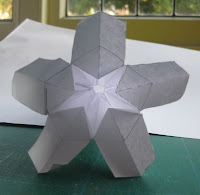
My nature object was an Ipomoea flower


This is my flat pattern:


This is the 3-D Version:

ESQUISSE # 2 -

This model was successful at holding 100kg of weight

It uses 8 pieces of corrugated cardboard